Wednesday 23 December 2015

What 2016 Has In Store For Mobile Apps And Html5?

With a lot of options comes confusion. This is something that is happening in the current mobile app development world. With an ample lot of devices, we have now several development options that are lingering around in today's development world.

We now have three different development options in front of us, and they have their benefits. This is the reason business owners get confused while choosing the best option for their mobile development. Native app development offers its advantages and when it comes to performance no other technology has yet met its competitive levels. However, this requires quite an astute observation as you need to make a tailored version for all the type of operating system or device existing.


Wherein, when it comes to HTML5, you do not have to invest a lot to give your users a tailor made experiences specifically for all the operating system or devices. But unlike the native apps it lags the exposure of the app store and other device rich functionality. It is also a better to convert PSD to HTML5 online because nowadays people are moving to mobile applications rather than the PSD files also.


Mobile apps and their future

When it comes to mobile, there are a lot of reforms made when it comes to the status of using mobile phones at organizations. Looking at these advantages, many organizations have now started running on the concept of BYOD which means bring your own device at work. This is adopted mostly by those organizations that aim at the mental presence of the employees rather than the physical presence.

The increasing pressure of the BYOD trend to deploy mobile friendly applications on organizations to reconcile mobile work styles will lead businesses to manage a portfolio of mobile application architectures by their employees, and hybrid architectures will be especially well-suited to business-to-employee applications,” adds Van Baker, Research VP at Gartner."

Moreover, according to him firms must continue to develop more to find plunge more into technology and get better approaches for reasonable development which can help every firm irrespective of their scale to make use of the mobile platform to market their business.

HTML5 in game development


HTML5 has emerged as one of the most reckoning force when it comes to game development. Moreover, there are various platforms that support games development on HTML5 and JavaScript only. This is not a flimsy talk, but we have proof that it is one of the best tools for game development.

  1. Pixi.js
  2. Phaser
  3. Construct 2
  4. ImpactJS
  5. Babylon
  6. Turbulenz

HTML5 is appearing as one of the most favorite technology for game developers, and this can be derived from the fact that there are numerous apps being launched now and then in the market.


The best part about HTML5 game is that they run on all the devices irrespective of their operating system. For instance, no matter you have a PC or Mac laptop or Android or iOS smartphone, or you just want to play it on your Firefox, Tizen or any other operating system that supports HTML5. This property itself is a major USP and user driver.

Challenges for mobile app developers: Testing


Testing is an infallible way to know what your customers wish to have from your mobile app. This is the reason user testing is the most favorable thing to do for your app before launching as then recommendations and reviews can be implemented in the final launch. In short, let the users themselves be the judge of your app. Testing open up avenues to get to know the interaction patterns and issues that are not apparent to you as the developer.


Crux: What suits you?

We know that there are an ample lot of resources available for building a native mobile app or HTML 5 based mobile sites. But the crux is that which development suits your needs. Though one can go for both if you think that you can afford both of them or if you think that your company needs both.


Native apps are best.


You need to go to developing native apps if you need to deliver a smoother user experience to the users. Moreover, if you wish to use all the native features which help in enhancing the user experience of your mobile friendly website.

Moreover, these apps are also recommended if you are building something that deals with confidential information.


Designing native apps make sure that you can tackle any of the issues related to it at its earliest. Though, people shirk off from updating their apps, but they do it as updating apps helps users to enhance their user experience.


HTML5 is best because...

Delivering the best user experience is what every designer aim at. HTML5 is one of the best technology that ensures consistency and better accessibility. Despite providing such a high degree of efficiency, you get to develop your HTML5 mobile websites at very reasonable rates. Your users will appreciate if you launch updates for your app as manually updating apps is quite difficult.


For those who choose even to opt for PSD to HTML5 converter, must make test and review the code rigorously before launching the app so as to make sure that their site delivers satisfactory user experience.

This is because it will be quite difficult to check a mobile site after launching, as all the mobile users will reach out to your mobile store.


Moreover, you need to remember the fact that a poor user experience is the cause of low conversion rate, low customer retention, and low revenue generation. The time has been changed now. Earlier people were restricted to only HTML websites only, but now the ultimate research in past few years has changed the standard of living and thinking of various people.


Author Biography:

Laurance Paul has worked hard in Designs2html Ltd to convert psd to html css files. He is mainly focused in working with website design and development sector since past few years. Apart from this he likes to sing, dance and focus on the current research & development of websites. He is into the area of file conversion also from last few years and has been showing his caliber with perfect methods and techniques.  

Saturday 19 December 2015

Css Frameworks That Are Gradually Replacing Bootstrap & Foundation

Though, Bootstrap and Foundation offer a high degree of competitiveness, but they are heavy weight frameworks which at some point or the other are responsive for delaying the loading time of the website. In order to improve this we now have frameworks engineered with cutting edge technology which improves the functionality and are light weight. We a designer wants to convert Photoshop to CSS than the functionality of these tools really helps them a lot.


1)ConciseCSS

ConciseCSS is another most crucial Css based framework built on SASS, Stylus and LESS. This architecture pays a golden path for maintaining the CSS. Moreover, those who do not prefer not to go for simple CSS, can also get this from them.

Likewise, ConciseCSS also gives you the leverage of base styles for crucial design elements such as tables, headings, forms, paragraph and other classes in order to make use of button style UI.


2)YUI

YUI is another open source framework based on JavaScript and CSS and needs no extra licensing fees. You can work on YUI which is available under a BSD license and developers can work on GitHub to contribute. This framework has been in the industry for a considerable period of time and hence it comprises of the API which helps them to load content using Ajax, work with DOM and inducing UI effects.

3)InK

In this continually changing technical world, InK is the kit for developing front end interfaces for providing a rich user experience to the users which works as reckoning force for business organizations. No matter what your project size is, you can count on this LESS based framework which offers responsive and fluid grid system. One thing which differentiates Ink from the others is it ability to handle layout, which induces a high degrees of flexibility in portraying your website on a different devices by looking to how your block looks within a grid.


4) Skeleton

All components that were included in the earlier version – buttons, forms and input elements – are still present, but basic typography styles are now set in rem unit.


The Skeleton is back in the market with a total make over. Despite of a lot of changed functionalities this framework is still very light weight. This refurbished system is back to the mobile first technique which makes assures that the website performs perfectly fine no matter what the screen size of the device is.


5) Furtive

Furtive is a modern Css framework which follows the Mobile-first precept for building modern web projects using the Rem unit for defining the size of the elements and the Flexbox for the grid. Furtive does not support the earlier version of the browsers as it holds bas a small amount of CSS footprint. This makes it one of the best framework for developing upcoming websites.

6) Mueller

This modular as well as the responsive grid system is created on Compass and Sass. The Grid can be created by adding classes in to the HTML elements or using the grid() function, for those who do not want to make a mess in their HTML function. For those who are looking forward to adapt the card style layout can use the Muller grid along with the Masonry JavaScript to get that effect.

7) HTML5 Boilerplate

Though it is not exactly a framework, but HTML5 Boilerplate is a template for the front-end of websites which is a prime requisite to build highly successful web applications. Apart from high design it comprises of Normalize.Cs, JQuery and Modernizer which are helpful in creating pages that can work on all browsers and can adapt to browsers and also on browsers which do not support some features. As the HTML5 boilerplate helps in the markup conversion of PSD to HTML5 design also, but sometimes the front end bootstrap framework needed for this also.

8) PowertoCSS

PowerCSS is a light framework design to render a strong front end for your websites. The names of the class used in the framework help in building the grid and apply styles in a very lucid way. It is easy to apply styles and remember them. It also gives you the opportunity if adding your own theme and also have StarterKit to get you going. While applying styles the process of PSD to CSS does not get effected just because of the powerful tool used in this layout and design.

9) Toast

Toast is a another flexible platform and allows easy configuration of the gutter, grid class names and also the column base and this is despite of the fact that the Css classes are included in the package.
This gives you the leverage of changing the number of columns as per your need. This is a very compacted framework which is flexible enough to meet all your tailored requirements.


10) Pure

This lightweight and compact framework of 4.5KB (Zipped) comprises of Css modules was built by Yahoo! It allows you to save your required pieces by compressing their sizes. This is well tailored of mobile devices and this is why it is compared with Bootstrap.

While these bootstrap frameworks also helpful in the conversion process of PSD to HTML responsive design, where the CSS and ultimate Bootstrap front end development is done extensively. The bootstrap has its own power in the area of Front end development, technology, because this is usually used by so many designers and developers who just including master professional design, frameworks, methods and innovation in the designing aspects of a website. If someone uses the above tools, then he or she will be able to achieve the stupendous, consistent, incessant and lucrative design with better conversion rate. The HTML5 bootstrap boilerplate has replaced various obsolete tools that were used in the past. This has been a great achievement for HTML5 developers who are having the in-depth knowledge of HTML5 language. This is true that with the advent of PHP7, CSS3 and HTML5 technology the user experience has been increased also.


Wednesday 2 December 2015

Gain a Competitive Edge By Choosing Professional PSD to HTML Services

Your website design is the first thing that users will notice when searching for your brand online. This means that your website design gives you a chance at creating a good first impressions on your target audience.

At present, designing a website is no more a difficult task and can be performed easily using pre-built theme or development tools. But remember that making use of such resources won't help you build a unique online identity.

But as you may know, with ever-increasing competition in the online marketplace, it is very important that your website can help you stay above the competition. Of course, that requires coming up with a fresh design that could help address your users needs in an effective way.

Secondly, you will also need to decide the language that will be used for creating your site. And make sure that the language can help you in creating modern style and responsive website. If you have created a PSD for your website, and are searching for the easiest way to convert your web design to a fully-functional website, then you could consider opting for HTML5 and CSS3 web technologies.

In essence, choosing to convert PSD to HTML can help you come up with a website that will help you gain a competitive advantage over your counterparts. Moreover, such a conversion also provides several benefits such as:

  • Having a design ready to be converted into HTML format will help save your time, and will enable you to carry out the conversion in no time.
  • Since you're converting your own design into an HTML theme, you will better have an idea of where all the elements are placed.
  • You will have better control over customizing your final theme.
But apart from the above benefits, there are a few downsides to opting for PSD to HTML conversion as well.

  • You might not be able to maintain the markup, if you and your team do not possess knowledge about the techniques used in creating the markup in the first place.
  • You may have limited resources to perform the markup conversion.
  • You may lack time to make continuous changes in your PSD files and so on.

Wondering what you can do to deal with such problems?

Well, you should consider taking up PSD to HTML Services of a markup conversion specialist. You can find several web development companies offering such conversion service. But don't be overwhelmed with the number of options you get to perform the conversion or be fooled into hiring any markup service provider to meet your project needs.

Below are some worthy tips you must consider, in order to ensure that you are bringing a credible service provider on board:

1. Look for markup service providers with good reputation.

A lot of your time goes into looking for a suitable markup service provider. And so, to make sure that your time is put to good use, it is advised that you should find an experienced service provider having good reputation in the market.

Besides, a developer with good market standing won't possibly offer low quality services, since his/her reputation is at stake.

2. Let your service provider know about issues within your page design.
Often you might encounter a few issues with your page design. Not informing about those issues to your service provider may result in developing an HTML site that doesn't match up to your expectations.

And so, it is very important that you must include some alert messages at the top of your design page, telling about your issues.

3. Discuss your website requirements beforehand.

Not all of the service providers can meet your varied markup conversion needs. Therefore, to save yourself from the last minute hassle of having to search for another service provider to complete your project, make sure to discuss your website requirements beforehand.

Conclusion

Converting your PSD files to an HTML5 theme will help you come up with a modern and responsive website. However, for performing the conversion in an effective manner, you should consider employing the services of a professional markup service provider.


Tuesday 24 November 2015

Take Your Website a Step Ahead With Photoshop to HTML Markup Conversion

Markup conversions have served as incredible tools for enhancing the overall performance of websites. Photoshop to HTML conversion has become one of the most sought after means of improving the look and feel of a web portal. There are professionals who are fully trained in performing PSD To HTML coding to yield a website that is not only cross-browser compatible but W3C Validated too. In this blog, you'll get to learn more about the effective pros of converting Photoshop files into HTML markup.
Search engines love HTML markup-based websites
A key reason behind the increased demand for PSD to HTML conversions is the improved search engine friendliness. Photoshop design based websites that are converted into HTML web portals have greater chances of getting crawled and indexed by all the major search engines such as Google, Yahoo, Bing, MSN etc. Since HTML sites are more readable, it becomes simple for the search engines to track and showcase them on the different search engine results pages. The PSD to HTML conversion expert will take utmost care in delivering you a website that is successful with all the web browsers available in the web world. Moreover, you may even opt for switching your HTML site to WordPress theme-based online portal. Known for its remarkable performance, WordPress will add a new tint of elegance and professionalism into your existing website.
Hand-coded PSD to HTML conversions serve expected results
Unlike the automated PSD to HTML conversions, the ones performed manually bear fruitful results. You can always ask your website conversion expert to indulge in hand-coding when it comes to converting PSD designs into HTML markup. Doing this will not only add crucial features to your site but even enhance its accessibility. Since coding is a pivotal part of every website conversion process, you need to pay special emphasis so as to avoid any errors that might crop in due to a wrong coding technique. Well, it is absolutely essential to clearly understand all the aspects related to converting your plain PSD designs into HTML Markup. Doing this will make things simpler for you in the long run. HTML-based websites are not only visually alluring but even contain functionalities that are easy to use and highly understood.
Conclusion

So make your website a real performer by converting the Photoshop designs to HTML Markup. Having done it for my own website, I guarantee you that such a website conversion will take you towards the route to business success, with visitors pouring in to your website and making huge purchases. 

Tuesday 3 November 2015

PSD To WordPress Conversion the Niftiest Approach to Website Success

Whether you are a website owner or an individual, if you are searching for a prolific way to propel traffic to your site, then PSD to WordPress conversion is the niftiest approach to build a site that helps to boost your online visibility. Every site owners covets to have a site that help keep visitors coming back for more, which demands a unique and captivating design.


Understanding the Essentially of Converting PSD To WordPress Theme


What makes WordPress a preferred choice for developers as a content management system is because of the host of fascinating themes/templates it offers to spruce up your website. A website theme is a vital determinant that plays a significant role in making your site a success. However, the problem is that there may be many other businesses using the same WP theme/template that you might have chosen as the backbone of your site. It is very important to distinguish your business website from your competitors site. And you can do so by transforming your Photoshop files to WordPress theme.


You can create a highly appealing design with the help of Photoshop software. But a PSD file can't be viewed on web browsers, and thus, you need to make your Photoshop files compatible to the browsers. By making your PSD file cross-browser compatible helps you to reach a wider audience, which requires converting PSD to WordPress Theme.


PSD to WordPress Theme Conversion Services

A Guide to Perform Accurate Theme Conversion


Analyze Your PSD: A theme acts as the backbone of your site. And it is important to design a theme that has the potential to attract visitors attention. Hence, to ensure to build an excellent WP design theme perform some analysis to understand how you want your theme to look like. This helps you to come up with a Photoshop design as per your vision and dream.


Slice Your PSD Files: Once you have analyzed your PSD, next chop up your PSD files into distinct layers including your brand logo, image and other sections.


Creating HTML/CSS Formats: In order to make your sliced PSD browser compatible, you need to code your sliced layers into HTML/CSS formats. While HTML helps in writing SEO semantic code, helping your site attain better search engine ranking, CSS on the other hand, is responsible for handling the designing deliverable consisting of fonts, color, etc.


Choosing an Expert to Integrate PSD Files to WordPress: Integrating PSD to WordPress themed site is a time-consuming process and can be intimidating. To make sure that your PSD files are integrated properly into WordPress theme without any blemish, it is imperative to take help of a WP professional. This is because a professional can help you carry out the conversion efficiently, and guarantees to provide you with high-quality conversion and thereby helps save a considerable amount of your time, while you get time to focus on other business aspects that needs your consideration. Look for an expert WP developer with a proven track record of providing successful PSD to WP conversion services to its clients.


PSD to WordPress theme conversion offers you outstanding and user-friendly WP theme/templates. If you want to have an outstanding PSD to WordPress theme conversion, it is recommended that you must have a closer look at the above discussed factors.


Friday 23 October 2015

3 Simple Tips To Improve Your Photoshop Skills

Photoshop is the standard tool that is used by designers and other creatives around the world – on a daily basis – for editing web and graphic designs. If you're a novice, then there are many things that you need to learn about Photoshop. Fortunately, there are many useful resources available over the web that can help you understand about using the Photoshop software. These skills must be kept in mind while converting Photoshop to HTML CSS because the conversion can only be possible just by knowing these tips.

However, going through all those resources to improve your Photoshop skills can be an overwhelming task. Through this post, I will share with you a few simple tips on how you can make the right use of online resources to make your Photoshop skills a lot better than ever before.

#Tip 1: Carefully Read The Instructions in the Photoshop Tutorials


There are numerous websites and blogs, and a lot more are being developed, focused on providing you with quality Photoshop tutorials. Such sites serve as valuable sources that continuously publish tutorials to help users improve their Photoshop skills.

In order to make the best use of the Photoshop tutorials, subscribe to the ones that you like the most. Doing so, will ensure that you don't miss out reading new posts related to the Photoshop software.


Lastly, be sure about reading the instructions within the tutorials carefully, as they'll make you follow a logical path to help you create a Photoshop based product on your own. Here is a list of tutorials you can refer to, for gaining better understanding of the Photoshop skills:

  • Photoshop Essentials
  • Photoshop Support
  • Tutorial9

#Tip
2: Start Experimenting


One of the best strategies to learn something new is to experiment. Simply put: working on the Photoshop software and applying features, settings, etc. you aren't familiar with will help you understand their use and potential in a better way.

The more you'll practice working on the Photoshop software, the more good your Photoshop skills will become. Moreover, experimenting with Photoshop will help in unleashing your creative side, and will make you a lot more comfortable with the software.

Of course, tutorials can help you teach how to work with the Photoshop software or you might get to learn about various skills. But you might need to adjust the techniques or skills – you've learned using the tutorial – to meet your specific design needs.


#Tip 3: Clear Your Basics Before Attempting To Learn Advanced Concepts

There's a lot you need to learn about using Photoshop. But, before getting a grasp of advanced Photoshop techniques, make sure to become well acquainted with the basics and fundamentals of Photoshop. After all, the fundamental concepts help in laying down the foundation of your design in Photoshop.

Especially, beginners must take out time to learn about Photoshop basics instead of trying to get familiar with advanced tutorials. Here is a list of some excellent online resources that will help you provide good knowledge about the basics of Photoshop:


  • Elite By Design: This website provides a week long program aimed at making people familiar with using Photoshop correctly. Through the program they address things such as shortcuts that will make it easy for you to work in the Photoshop software and so on.

Conclusion

There are different resources available online that can be used for improving Photoshop skills. However, beginners often fail to take the right advantage of those resources. To help you improve your Photoshop skills, in this post, I've discussed about three simple to follow tips to utilize the resources providing knowledge about Photoshop in the correct manner.

Author Biography:
From a long years of technical experience Samuel Dawson is now a Front End Manager in Designs2html Ltd. He is currently involved in Photoshop to html with efficient examples and demo. Samuel has shared the nice article on how you can improve your skills in Photoshop above.

Friday 10 July 2015

A handy guide on building WordPress theme using Bootstrap

As one of the widely used responsive frameworks, Bootstrap has been utilized for creating fully responsive websites and applications. But that's not all. Lately, developers have been using the framework for creation of responsive WordPress themes that can suit the requirements of different websites that are powered by WordPress CMS(Content Management System). Stay on this post as you'll be walked through all the steps that are associated with development of an eye-catchy WordPress theme using the Bootstrap framework. So, let's begin our journey about exploring the creation of a WordPress theme with Bootstrap.
Knowing the prerequisites for building WordPress theme using Bootstrap
  • Get WordPress installed in your system
  • Download and unzip Bootstrap files/folders
  • Install the Theme Test Drive plugin
Please note the third pre-requisite mentioned above is required only if you're building your WordPress theme using an already live website and hence don't want the public to view the theme while you're busy working on it.
Step 1- Within your WordPress admin panel, navigate to wp-content-> themes and open the directory which contains all the WordPress files. Here, create a new folder and name it as “wp-bootstrap”. Within this folder, paste the bootstrap folder which contains files like: css, img and js. Now, within the bootstrap folder, create a new file and name it as index.php.
Step 2- As per the second step, go ahead with copy pasting the source code fetched from the site into the index.php file(the one created in step 1 above).
Step 3- Build the main CSS page
Here, WordPress would require a specially formatted comment to be visible on top of style.css page. This comment would fetch all the meta information pertaining to the WordPress theme. Now, within the folder containing index.php page, create a new file and name it as style.css.
This simple theme was built using the example Bootstrap theme "Basic marketing site" found on the Bootstrap web site 
*/
Step 4- Upload a suitable image that would be displayed along with the WordPress theme
Here, opt for uploading the image that would be visible with the theme in WordPress admin area. You may choose an image with dimensions as 300 x 225 px or create a new one on your own.
Step 5- Login to your WordPress admin panel and go to Appearances-> Theme. Here, you'll be able to spot a new theme named as WP Bootstrap. Click on 'Active' link for this theme to make it your site's current theme.
Step 6- Transform the Bootstrap files into WordPress templates
Start off by creating empty files for header.php, sidebar.php and footer.php. Now, copy and paste all the HTML that's included at the top of every page, into header.php file. Follow the same procedure for the HTML that appears at every page's bottom and paste it into footer.php file. Next, use two tags viz: get_header() and get_footer() which will find the header.php and footer.php files and include the same to the top and bottom of page respectively.
The index.php file would now look like this:
<?php get_header(); ?>
<!-- Main Message unit for a primary marketing message or call to action -->
<div class="message-unit">
<h1>Hello, world!</h1>
<p>This is a template for a simple marketing or informational website. It includes a large callout called the hero unit and three supporting pieces of content. Use it as a starting point to create something more unique.</p>
<p><a class="btn btn-primary btn-large">Read more &raquo;</a></p>
</div>
<!-- Example row of columns -->
<div class="row">
<div class="col-xs-6 col-md-4 ">
<h2>Heading</h2>
<p>The dummy text is being used as Lorem Ipsum which is used simply for the printing of various dummy texts and typesetting industry. This is been the top standard dummy text which is ever since the 1500s, when an unknown printer took a type of galley and scrambled it to make a type specimen book. </p>


<p><a class="btn" href="#">View details &raquo;</a></p>
</div>


</div>
<?php get_footer(); ?>
Step 7- Within the same folder as the header.php file, create and open the functions.php file and paste the below mentioned code in it:
<?php 

function wpbootstrap_scripts_with_jquery()
{
        // Register the script like this for a theme:
        wp_register_script( 'custom-script', get_template_directory_uri() . '/bootstrap/js/bootstrap.js', array( 'jquery' ) );
        // For either a plugin or a theme, you can then enqueue the script:
        wp_enqueue_script( 'custom-script' );
}
add_action( 'wp_enqueue_scripts', 'wpbootstrap_scripts_with_jquery' );

?>
Step 8- Create the WordPress Homepage
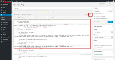
With the basic static template being setup appropriately, go ahead with creating a WordPress homepage. For this, just go to your WordPress admin area and click Pages-> Add New. Here, provide a suitable title for the page like “Home” and finally click on HTML tab available above the default Content Editor. After this, cut the rest of markup from index.php file and paste the same into this new 'Homepage' followed by clicking the “Publish” link. The Homepage would now look like this:


Next, we'll be using the popular WordPress function called the Loop for including the Home page content(the one added in WP admin area) into the template. The structure of this loop would be like this:
<?php if ( have_posts() ) : while ( have_posts() ) : the_post(); ?>
<?php endwhile; else: ?>
<p><?php _e('Sorry, no posts matched'); ?></p>
<?php endif; ?>
The index.php file with the above loop would now look like this:
<?php get_header(); ?>
<?php if ( have_posts() ) : while ( have_posts() ) : the_post(); ?>
<?php endwhile; else: ?>
<p><?php _e('Sorry, no posts matched '); ?></p>
<?php endif; ?>
<?php get_footer(); ?>
Step 9- Add the WordPress code that pulls in page's title and content
Code for title would look like the_title() and code for content would be like the_content(). The altered loop structure would now look like this:
<?php if ( have_posts() ) : while ( have_posts() ) : the_post(); ?>
<h1><?php the_title(); ?></h1>
<?php the_content(); ?>
<?php endwhile; else: ?>
<p><?php _e('Sorry, no posts matched '); ?></p>
<?php endif; ?>
Step 10- Add extra pages and navigation
In this step, you'll be required to add new pages like About, Contact and News in your WordPress admin area. Additionally, in order to replace the website's static navigation menu with the one where pages just added in the back-end are displayed, just follow a simple process. Get on with finding unordered list with the class as “nav” and delete list items. The updated markup within the div with calss “navbar” would now look like this:
<div class="navbar navbar-inverse">
<div class="navbar-inner">
<div class="container">
<a class="btn btn-navbar" data-toggle="collapse" data-target=".nav-collapse">
<span class="icon-bar"></span>
</a>
<a class="brand" href="#">Project name</a>
<div class="nav-collapse collapse">
<ul class="nav">
</ul>
</div><!--/.nav-collapse -->
</div>
</div>
</div>
Next, just add the below code into the empty unordered list with the “nav” class:
<ul class="nav">
<?php wp_list_pages(array('title_li' => '')); ?>
</ul>
In the above code, wp_list_pages() will create a list item along with a link for each web page.
Step 11- Create templates for posts and pages
For creating the pages template, just save the index.php file as page.php file. Firstly, change the text “Sorry, no posts matched your criteria.” to “Sorry, this page does not exist.”. Next, create a two column layout by adding some Bootstrap markup as shown below:
<?php get_header(); ?>
<div class="row">
<div class="col-md-8">
<?php if ( have_posts() ) : while ( have_posts() ) : the_post(); ?>
<h1><?php the_title(); ?></h1>
<?php the_content(); ?>
<?php endwhile; else: ?>
<p><?php _e('Sorry, this page does not exist.'); ?></p>
<?php endif; ?>
</div>
<div class="col-xs-6 col-md-4">
</div>
</div>
<?php get_footer(); ?>
In the above code, the “col-md-8” class is for the page content and “col-xs-6 col-md-4” class is for the sidebar content.
Next, go to your page.php file and add get_sidebar() in the “col-xs-6 col-md-4 ” div as shown below:
<?php get_header(); ?>
<div class="row">
<div class="col-md-8">
<?php if ( have_posts() ) : while ( have_posts() ) : the_post(); ?>
<h1><?php the_title(); ?></h1>
<?php the_content(); ?>
<?php endwhile; else: ?>
<p><?php _e('Sorry, this page does not exist.'); ?></p>
<?php endif; ?>
</div>
<div class="col-xs-6 col-md-4">
<?php get_sidebar(); ?>
</div>
</div>
<?php get_footer(); ?>
Now, in order to create the template for a single post, just save your page.php file as single.php file. After adding the hr tag and content page, the single.php template will look like this:
<?php get_header(); ?>
<div class="row">
<div class="col-md-8">
<?php if ( have_posts() ) : while ( have_posts() ) : the_post(); ?>
<h1><?php the_title(); ?></h1>
<p><em><?php the_time('l, F jS, Y'); ?></em></p>
<?php the_content(); ?>
<hr>
<?php comments_template(); ?>
<?php endwhile; else: ?>
<p><?php _e('Sorry, this page does not exist.'); ?></p>
<?php endif; ?>
</div>
<div class="col-xs-6 col-md-4">
<?php get_sidebar(); ?>
</div>
</div>
<?php get_footer(); ?>

Step 12- Adding finishing touch to the responsive WordPress theme
In order to have the name of page or post in the title and name of the website, just use the WordPress tag called wp_title() which must be customized in the below mentioned format:
wp_title('|',1,'right');
Finally, get on with widget theme by simply adding the below code to the theme's functions.php file:
<?php
function wp-bootstrap_scripts_with_jquery()
{
// Register the script like this for a theme:

wp_register_script( 'script', get_template_directory_uri() . '/bootstrap/js/bootstrap.js', array( 'jquery' ) );
// For either a plugin or a theme, you can then enqueue the script:
wp_enqueue_script( 'custom-script' );
}
add_action( 'wp_enqueue_scripts', 'wp-bootstrap_scripts_with_jquery' );
if ( function_exists('register_sidebar') )
{
'name' => __('Widget Name Here'),
'description' => __('Widget Description Here'),
'id' => 'widget-id',
'before_widget' => '<div id="%1$s" class="%2$s">',
'after_widget' => '</div>',
'before_title' => '<h3>',
'after_title' => '</h3>'
));
}
?>
After this, simply go back to the sidebar.php file and replace the static content with the text shown below:
<?php if ( !function_exists('dynamic_sidebar') || !dynamic_sidebar() ) : ?>
<?php endif; ?>
With that you're theme is ready for a quick download!
Conclusion
So, that was an elaboration on building a fully-functional WordPress theme using the Bootstrap framework. Hope you'd have followed the steps covered in this tutorial. If you've found some issues, do let me know using the below comments section.

Hopefully, you had enjoyed this post but some times while moving from the static files which are specially in Photoshop and to move from PSD to WordPress Conversion also matters with bootstrap technology which helps to maintain a best criteria for Bootstrap themes.